
Why Your Brand Looks Different Everywhere, and How to Fix It
Your website feels minimal. Your Instagram is pastel and playful. Your latest campaign has gone full luxury. They all use the same logo, but somehow they feel like three different businesses.
This is where I’d look at the direction behind the design.
When every new asset starts with “what looks good today?”, your brand can slowly drift. Each individual piece might be beautiful. Together, they make it harder to understand what your business feels like.
Diagnose the mismatch before redesigning the logo
Collect screenshots of your homepage, a product or service page, your last nine social posts, a recent email, and packaging if you have it. Put them next to each other.
Look beyond whether the colors match. Ask:
Does the typography behave similarly?
Do the images share a recognizable approach?
Do layouts feel related?
Is there a consistent balance of playful and polished?
Would this still feel like one business if you covered the logos?
That last question is one I’d use early. Your logo is part of recognition, but the rest of the design needs to contribute too.
Find the decisions you keep making from scratch
Maybe your fonts are settled, but every post uses different sizes and spacing. Maybe the palette is defined, but there’s no guidance on which color should lead. Maybe you have a brand board, but no one has decided how the photography should feel.
These are different problems, and they need different fixes.
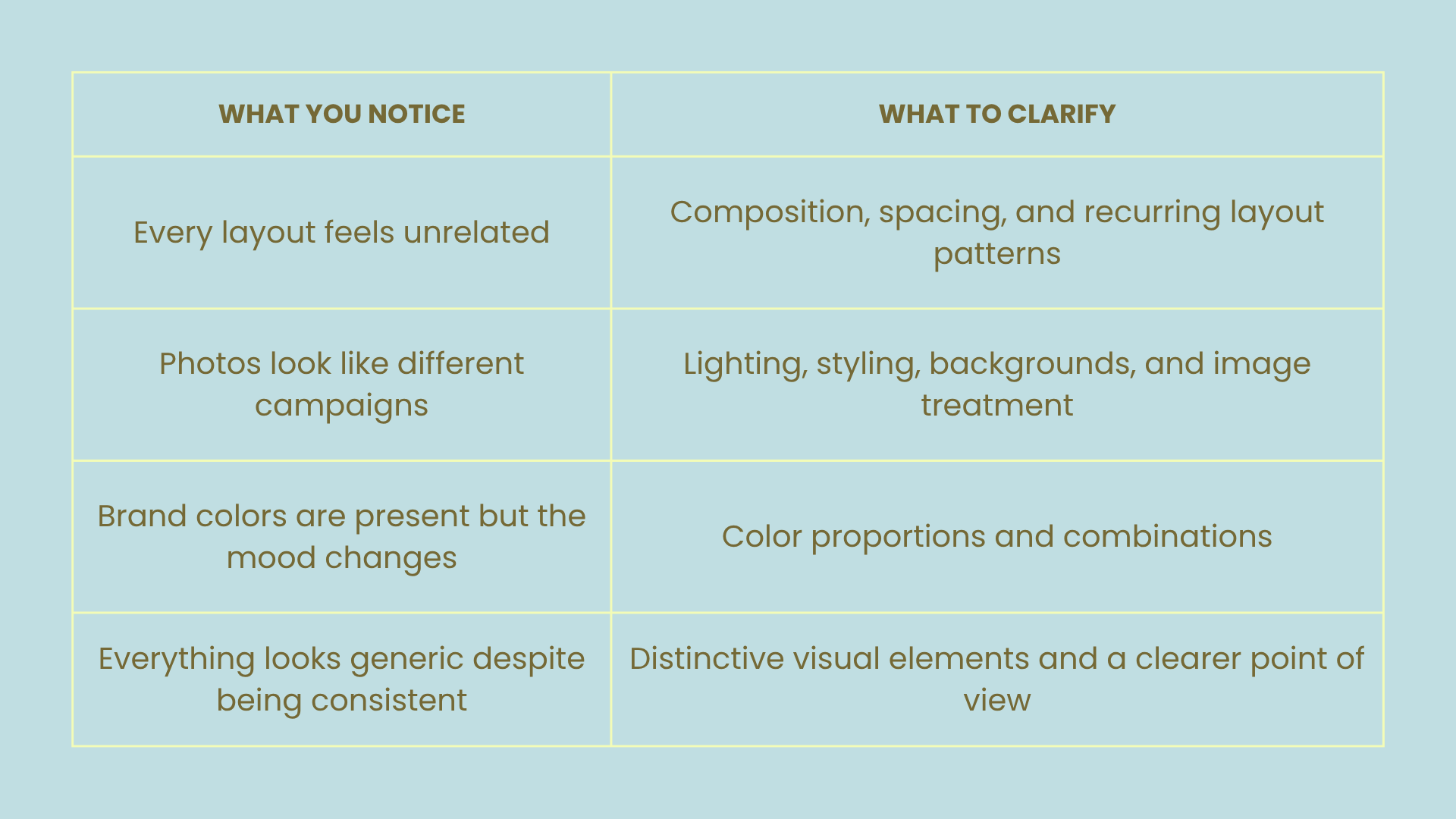
Translate the mood into usable rules
“Premium,” “feminine,” and “bold” can mean almost anything. A team needs to understand how those words turn into actual decisions.
For example, you might interpret feminine through expressive typography, warm color, and tactile styling. Another brand might express it through delicate details and quiet photography. Both are valid, but mixing them without intention can produce a confusing result.
This is also why I wouldn’t automatically add gold to make a brand feel more premium. A metallic finish can make sense for a physical product. A flat gold gradient in every digital asset creates a different impression. I’d assess the material, execution, and context before choosing it.
The useful question is: what visual choices support the experience you want customers to expect?
Create a small set of repeatable examples
Choose a few common applications and design them properly: a social announcement, a website section, an email header, and a product or service introduction.
Use these to demonstrate your rules in practice. Show how the typography works, which colors lead, how much space to leave, and what kind of imagery belongs there.
My POV: guidelines become much more useful when they show the brand doing its everyday job. A page of color codes won’t tell you how to introduce a new product next Tuesday.
Keep room for the brand to move
Consistency doesn’t mean repeating the same layout forever. Define what stays recognizable and where the brand can flex.
A seasonal campaign might introduce a new setting or a supporting color while keeping the typography, styling approach, and key graphic elements familiar. Your website can be calmer than your social feed while still sharing the same visual language.
Decide whether the identity needs to change
If the current identity still fits your business and customer, better direction and application may solve the problem. If your audience, offer, or positioning has changed, you may need a deeper identity project.
Start with the audit. It gives you a clearer brief than “everything feels off.”
If your brand has the pieces but needs a clearer overall direction, explore Sundae Mood’s branding and creative direction services.
